Society Living
Property Website Template
Designing a website template for PMG's metro brand, Society Living, means crafting a modern experience that reflects an social lifestyle. Bold visuals, dynamic layouts, and seamless navigation will engage renters.
Web Design
UI/UX
Branding
Copywriting
Client Discovery
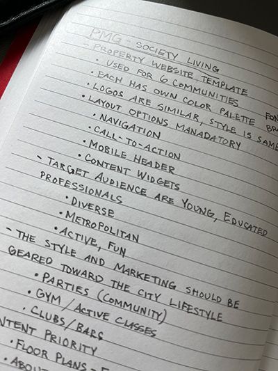
The journey begins with a discovery call, diving into PNG’s vision for Society Living—an upscale, metro-living brand that blends sophistication with a vibrant, social energy. The goal is to create a dynamic, high-end website template that not only captures the brand’s essence but also provides flexibility for at least seven unique communities. Each community will feature its own distinct color palette, adding individuality while maintaining a cohesive look and feel under the Society Living umbrella.
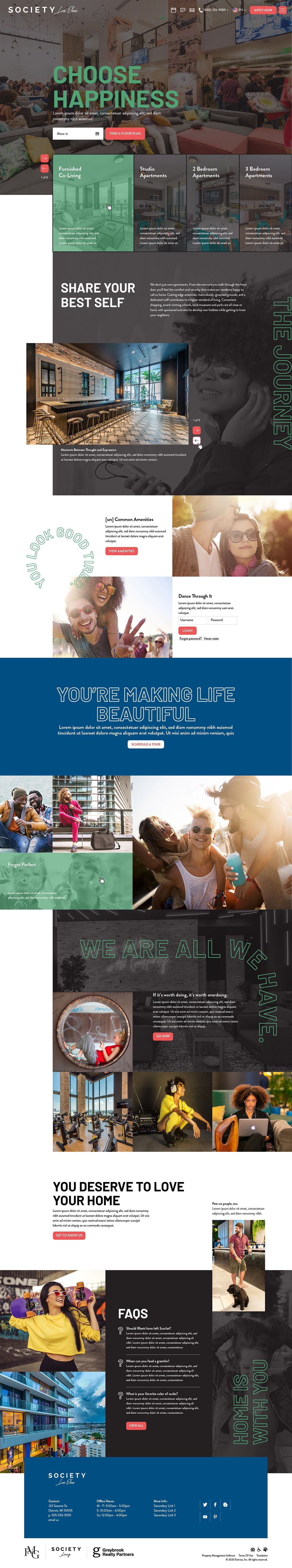
The template’s foundation will focus on an intuitive layout that prioritizes usability and engagement. Content requirements include a floor plan section to showcase availability, a compelling property description to highlight the unique living experience, and a community gallery to bring the spaces to life. An amenities section will clearly outline key perks, while a streamlined scheduling tool will make booking a tour effortless. An embedded Instagram feed will provide a constant flow of lifestyle imagery, reinforcing the active, social vibe of Society Living. To ensure a seamless user experience, an FAQ section will address common inquiries upfront.
Beyond design, the template will incorporate all necessary settings and functionalities to ensure smooth performance across all communities. By balancing aesthetic appeal with practical functionality, this project will deliver a premium, scalable solution that elevates the Society Living brand across multiple properties while giving each location its own unique identity.
Planning goals, content, and structure first makes website design smoother, ensuring a smooth and effective final result.

Similar, but different
Requested layout options, including menu, button styles, and mobile headers ensures each community maintains its own character while staying unified.
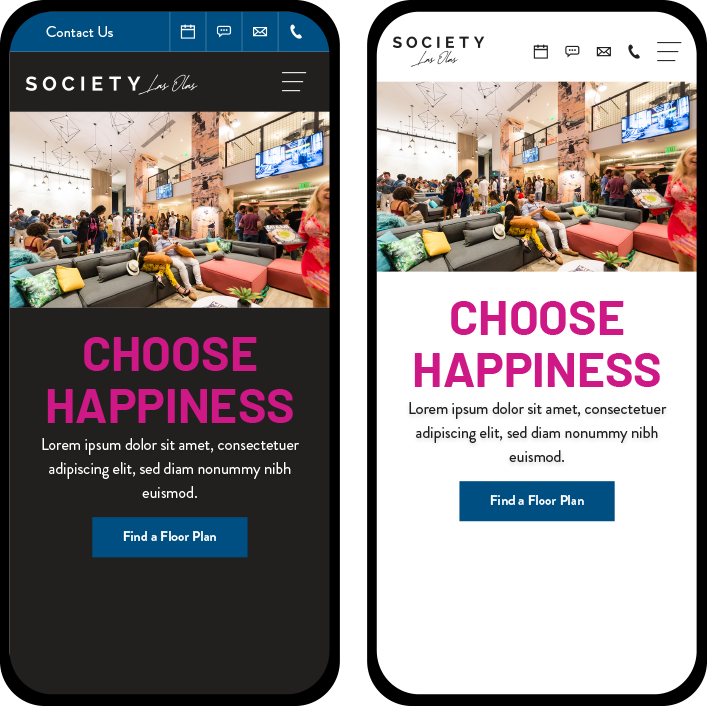
Mobile Layout Options
For this project, the mobile header needs to be sleek and functional, giving users the flexibility to create the perfect first impression. This template was created to offer two distinct background image options—Full Screen for a bold, immersive look or Actual Size for a structured layout. Depending on the choice, the call-to-action can be displayed either over an image with an overlay or neatly positioned below it.
For menu organization, there are two layout options. The Stacked menu places contact methods above the website menu for easy access, while the Standard layout keeps everything in a single row for a clean, streamlined look. These choices ensure that every property’s brand and user experience feel just right, no matter the design preference.
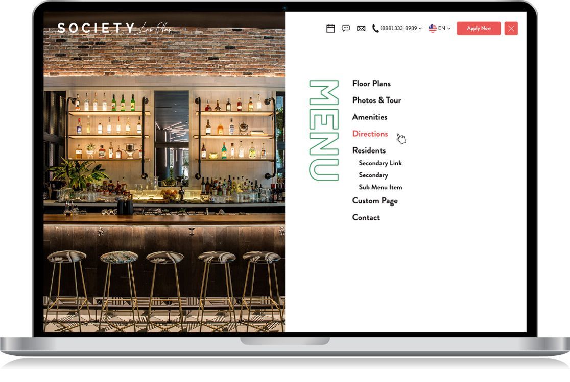
Navigation Layout Options
This template serves up stylish, flexible navigation layouts to match its vibrant, modern brand. Each option includes the essentials—logo, hamburger menu, custom button, and all the must-have contact icons. But here’s where it gets fun—these elements can be rearranged to create unique styles while keeping everything sleek and user-friendly.
From clean and minimal to bold and high-contrast, each layout offers a distinct look while staying functional and intuitive. Whether stacking elements for a structured feel, centering everything for balance, or separating contact icons for extra visibility, these options ensure that every Society Living community gets a navigation style that matches its own personality


Menu Layout Options
The Full Bleed option creates an immersive experience with a bold background image and overlay. For a more subtle effect, the Half-Screen option features a sleek, semi-transparent design. The Half-Screen Dynamic splits the screen with a black background on one side and hover-activated images on the other, providing a modern twist. Meanwhile, the Half-Screen Image combines a striking image with a clean white background for clear readability.
Each option brings a unique element to the design while maintaining the sophisticated, modern feel of Society Living.
Property Color Options
Designing a website template that adapts to multiple properties means creating a flexible system where color does the storytelling. With at least six properties, each with its own primary and secondary colors, the template needs to shift its palette while keeping the design cohesive.
A beachfront retreat might call for blues and sandy neutrals, while a sleek urban high-rise could lean into charcoals and metallics. The key is making sure each property's unique identity shines through while maintaining a polished, unified look. It’s all about balance—letting the colors do their thing without overwhelming the foundation.


Home, sweet home... page
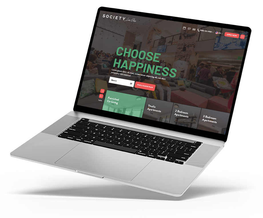
The final homepage ties everything together—content priority, sleek design, and smooth navigation—for a site that looks great and works effortlessly!
Mobile

Desktop