
Amavi
Multifamily Website
Millcreek’s new brand, Amavi, needs a new website for their housing development. Focused on clean layouts, interactive galleries, and smooth navigation, the site makes browsing rental homes effortless and engaging.
UI/UX
Branding
Web Design
Case Study
Copywriting
Client Discovery
Oh, the journey to this beauty? A wild mix of deep dives, creative sprints, and a few "Wait, what if we tried this?" moments. First, the client conversation—big goals, even bigger excitement. Amavi (by Millcreek) needed a site that felt warm, modern, and community-driven. But since the brand was fresh off the press, we had some wiggle room with colors. Fonts and logos? Locked in. Patterns? Marketing provided a single asset.
Then came the strategy: What matters most? Leasing conversions. That meant a crisp, intuitive layout with a hierarchy that guided users straight to action—apply, tour, check availability. The storytelling had to flow: aspirational living, family-friendly perks, and visuals that sold the dream. We structured content strategically, balancing emotion (cute dog) with logic (floor plan options, amenities). Every CTA was placed with intent. The visuals? A blend of lifestyle and architecture to make future residents feel right at home.
Target Audience
Target audience:
Young professionals, families
Content priority:
1. Apply
2. About Us
3. Amenities
4. Gallery
5. Floor Plan
6. Area
7. Reviews
8. Tour
9. Availability
10. Residents
Starting Point
This project was meant to define the default style of the Amavi brand. No pressure.

Logo Variations
Amavi’s logo lineup is versatile. There’s a wordmark, a symbol logo, and a combo version for balance. These options can be used throughout the design to fit whatever layout is available.

Required Pattern
The abstract green bokeh pattern brings a airy feel to the design. Soft, blurred light adds depth while the green tones evoke nature and tranquility. It’s the perfect backdrop for secondary containers.

Headline & Body Fonts
This site uses three Adobe Typekit fonts. A contemporary, serif font for impact, an uppercase font for balance, and a legible font for effortless flow. Typographically, they play well together.
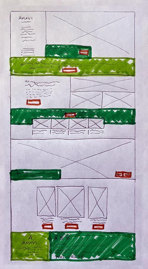
First Draft
First drafts are always fun. Amavi wanted its website fresh, modern, and all about suburban family living. So, we dove headfirst into making something bright, inviting, and packed with "I can see myself living here" moments.
We played with airy layouts, crisp typography, and several color variations that whispered "fresh start" without being boring. Lifestyle imagery? Non-negotiable. We wanted future residents to feel the backyard BBQs, the lazy Sundays, the carefree bike rides.
The challenge? Balancing warmth with clarity. Every section had to be easy to navigate but still tug at the heartstrings. The first draft? A solid start—refined, welcoming, and bursting with potential. Now, time for feedback and tweaks!
Back to the drawing board
The client wanted a brighter look, so we added more white space for an open feel. They also requested a hero section without an overlay, letting the imagery shine and create a welcoming first impression.
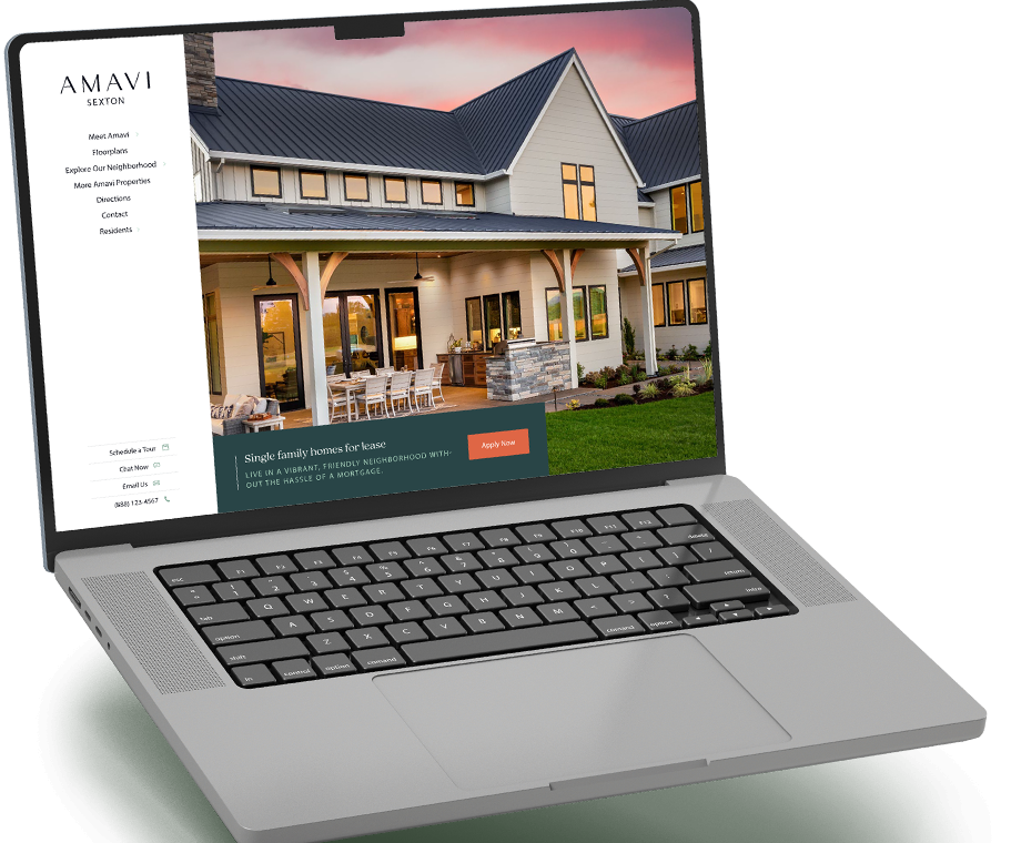
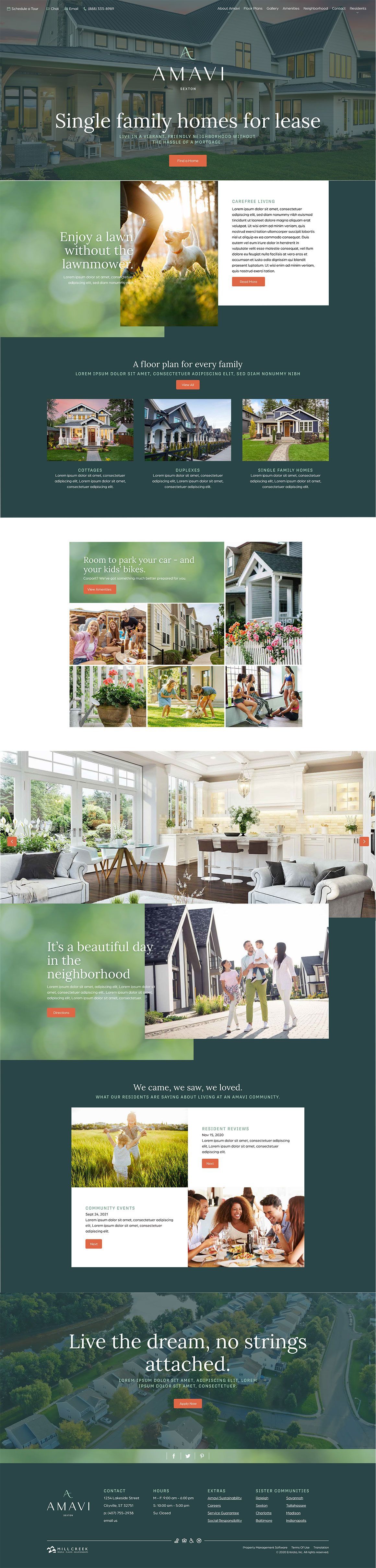
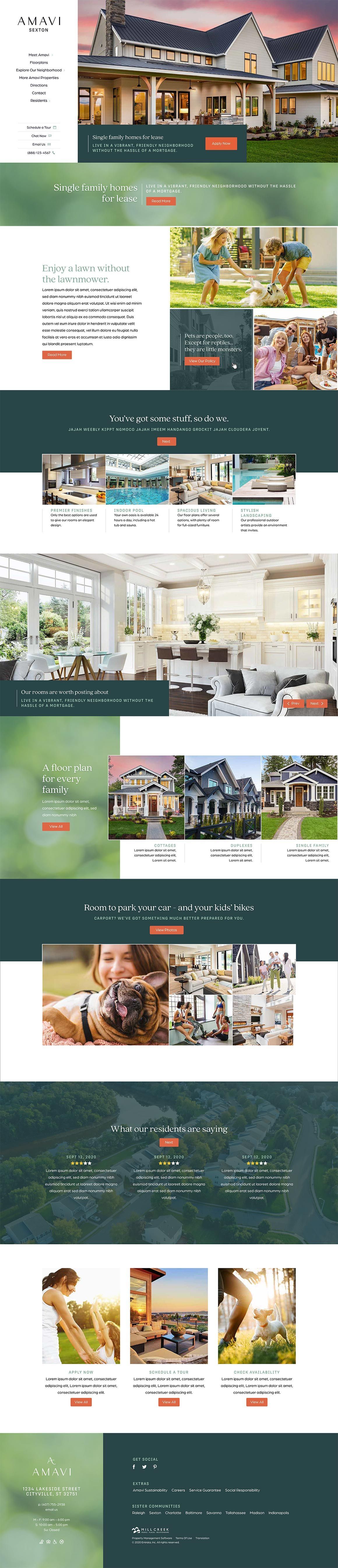
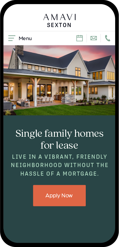
Homepage
Redesigning this homepage was a combination of client suggestions and designer reflection. The client wanted the header to shine without an overlay, so the quality of the homes could speak for themselves. Extra white space keeps things light and airy, making the site feel as open as the floor plans.
A rich, cozy color palette sets the mood, while bold call-to-action buttons make navigating a breeze. Gorgeous images bring the lifestyle to life, and playful yet polished typography keeps it fun but classy. Every detail works together to make finding a dream home feel effortless and exciting!
Make it smaller!
Don't worry, we can fit all of that content on your mobile device, too.
Home
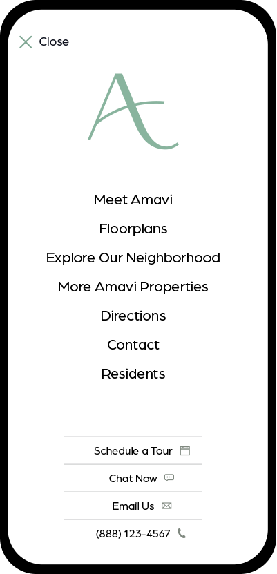
Open menu
About us
Values
Reviews
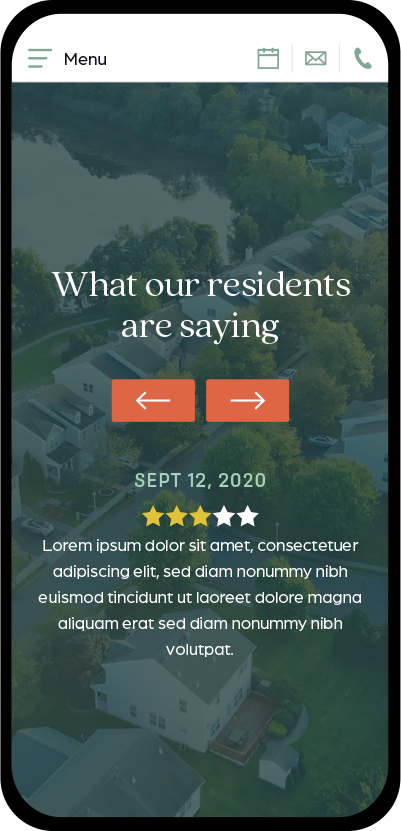
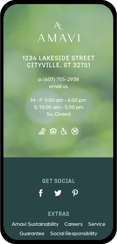
Footer
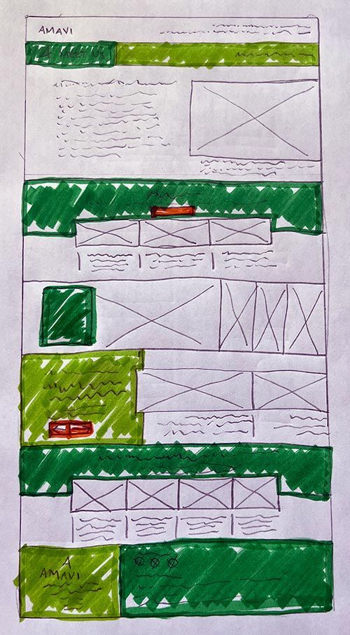
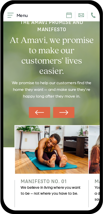
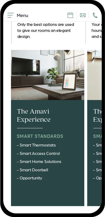
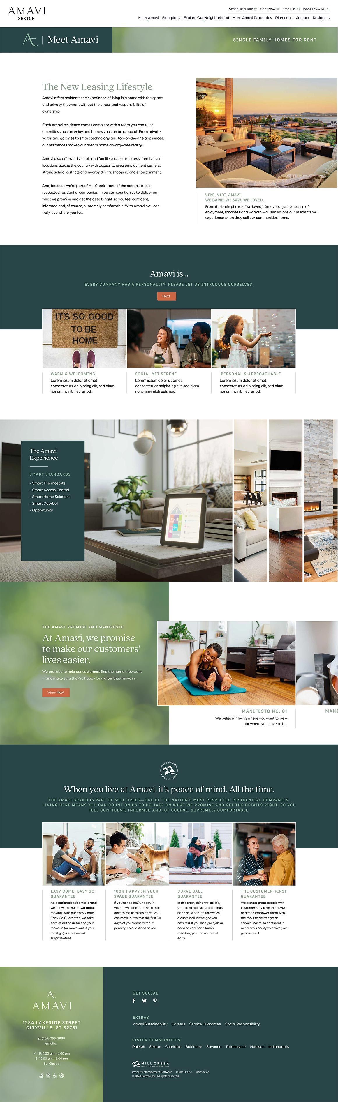
About Us Page
Designing the "About Us" page for Amavi was all about creating an experience that feels natural and engaging. The content flows seamlessly, guiding users through Amavi’s values and standards without feeling overwhelming.
Interactive elements, like sliders and expanding images, invite users to explore rather than just scroll. Each section is strategically placed to highlight key selling points while maintaining a relaxed, welcoming vibe.
The balance of text and visuals ensures clarity without clutter, reinforcing Amavi’s promise of effortless, stress-free living.
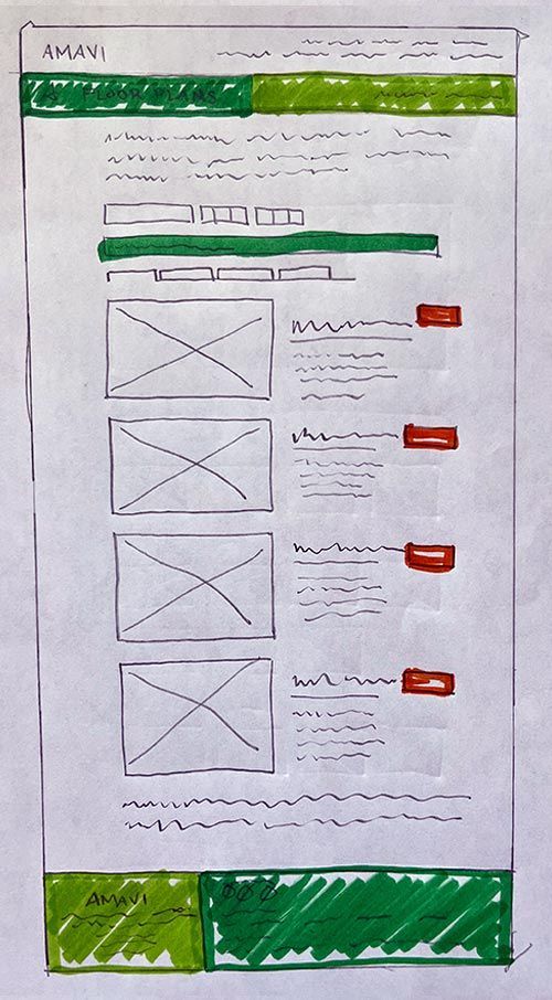
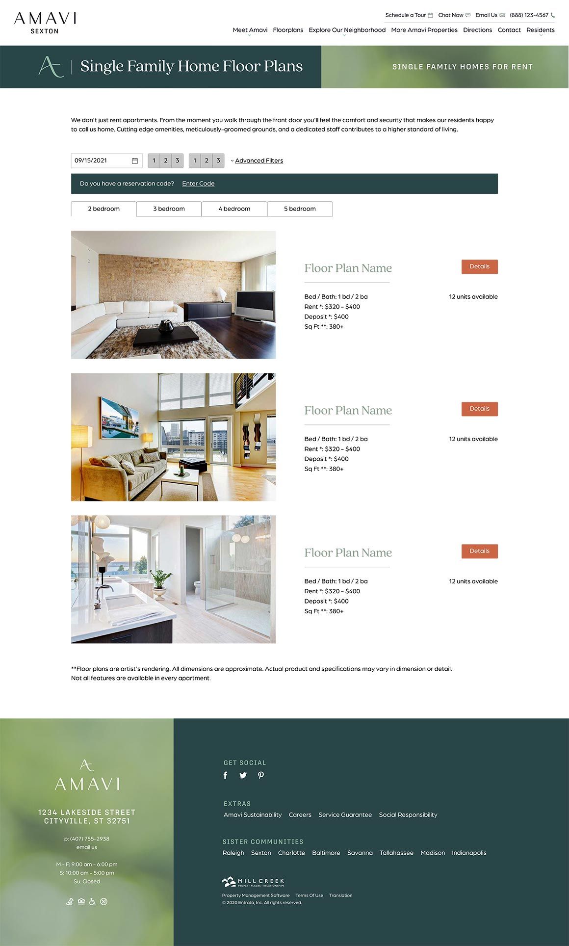
Floor Plan Page
The floor plans page keeps things simple and ultra-functional. Users can easily filter by bedroom count and browse stunning images that showcase the lifestyle, not just the layouts. Every detail, from the spacious images to the crisp typography, makes finding the perfect fit effortless. With a focus on clarity and accessibility, this page ensures that future residents can explore their options without the hassle.
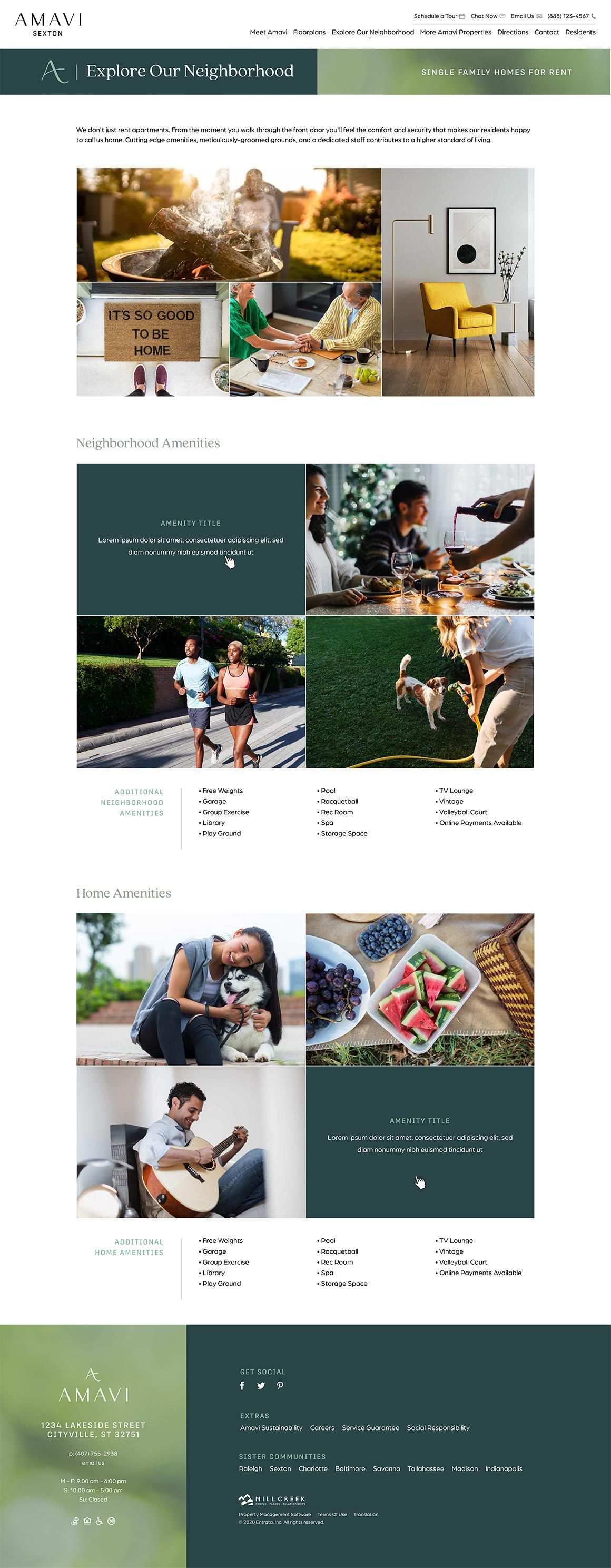
Neighborhood Page
The Neighborhood page features a clean grid layout with hover-able images that reveal key details—spacious interiors, modern finishes, and vibrant community perks. Smooth animations guide users through home and neighborhood highlights, balancing bold typography with airy whitespace. A warm, natural palette enhances the inviting feel, creating a seamless, visually rich experience.
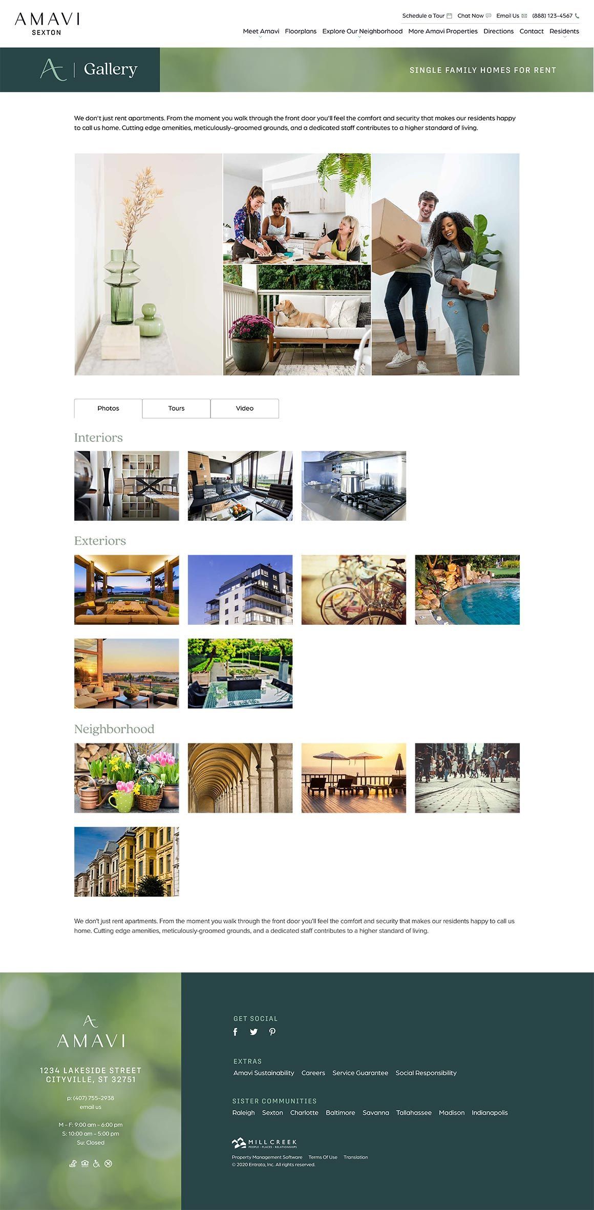
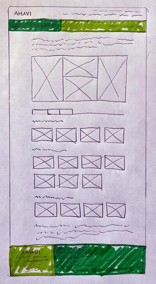
Gallery Page
This gallery page features a sleek grid layout, letting users filter by photos, tours, and videos. When an image is selected, it opens a lightbox, displaying the thumbnail at full size for a more detailed view.
Whether browsing images or exploring virtual tours, the design enhances the experience, making every interaction feel polished and engaging.