
Peak Campus
Corporate Website
Peak Campus is a multifamily real estate company specialized in student housing. With over 80 properties in their portfolio, Campus wanted a corporate website to showcase their extensive catalogue.
UI/UX
Branding
Web Design
Case Study
Copywriting
Client Discovery
A discovery call between a multifamily company and a web designer is like the first chapter of a great collaboration story—where big ideas meet thoughtful strategy. During this call, we dive into understanding the company’s goals, whether it’s boosting occupancy rates, enhancing resident experiences, or showcasing properties in a fresh, dynamic way. We discuss the brand’s personality and how it can shine through visual design and user experience.
We'll chat about target audiences, exploring what makes potential residents tick and how the website can meet their needs. The conversation also covers technical needs, from property management integrations to lead generation tools. And of course, we’ll talk about timelines, budgets, and success metrics—all while keeping the vibe collaborative and creative, with a sprinkle of fun brainstorming to spark inspiration. By the end, we aim to leave the call with a shared vision and excitement for building a website that turns browsing into leasing!
Target Audience
Primary:
Investors
Content:
1. Statistics
2. Properties
3. Services
Secondary:
Employees
Content:
1. Careers
2. Culture
3. Instagram
The pieces of the puzzle
Colors, fonts, images, and icons all snap into place, creating a website that feels fresh and totally on-brand!

Logo Options
Logo options include vertical and horizontal versions for flexible layouts. Keep a margin equal to the capital 'P' height for a clean look. On dark backgrounds, use the reverse color to make the logo pop!

Typeface
The typeface is Montserrat—Bold for headings, Regular for subtitles, and Light for body text. Headlines use #000000, while body text stays ADA-compliant with a neutral #757575 for ideal readability.

Color Palette
With a crisp white base for a clean look, our primary color will drive action—think buttons and links—while the secondary color adds flair to design elements, keeping the vibe fresh and fun throughout.

Look and Feel
After a word cloud jam with Peak Campus, we nailed a site tone that's clean, young, fun, active, and modern—these vibes will shape the layout, colors, and copy for a fresh, engaging experience!

Buttons
The primary button sports a tiny triangle in the top-left corner—an ode to the logo. On hover, it expands to fill the button, adding a dynamic touch. Smooth easing curves keep the animation feeling natural.
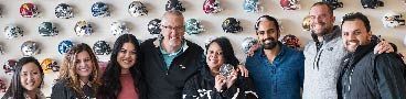
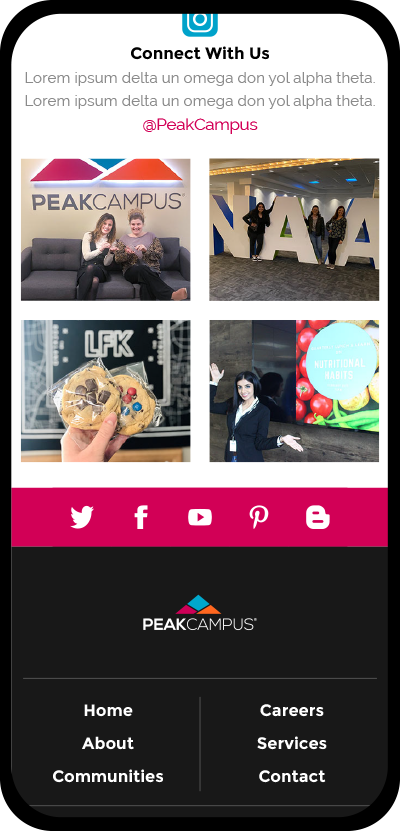
Imagery
I recommended the client provide all images to keep things authentic. This approach gives employees a sense of ownership, making the website feel genuinely theirs and adding a personal touch.
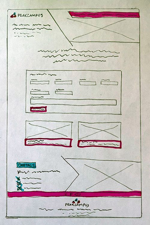
Rough Draft
Quickly sketching layouts is key—no overthinking. Wireframes help visualize the final product and keep the creative process flowing.
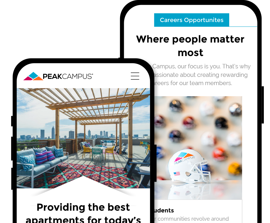
Think Responsively
With 55% of viewers coming from mobile devices, it is necessary to design with phones first.
Landing
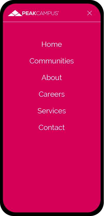
Open Menu
Careers
Homepage
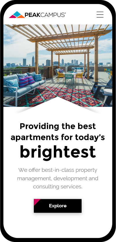
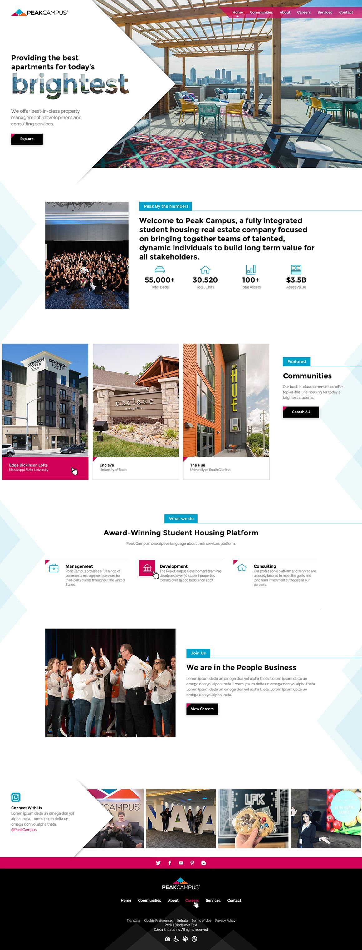
The homepage for Peak Campus was crafted with a clear and powerful call to action in the upper fold, ensuring users instantly know how to kick-start their search. Each service is neatly explained, guiding users through what is offered, from project statistics to featured properties.
No matter where they click, they’re seamlessly led into related projects, keeping the experience smooth and engaging. Angles were cleverly used to echo the logo and add a playful, non-directional focus to key elements. As users scroll, parallax peaks gently sweep along the page edges, adding a natural vibe that feels dynamic.
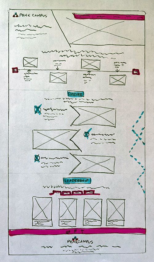
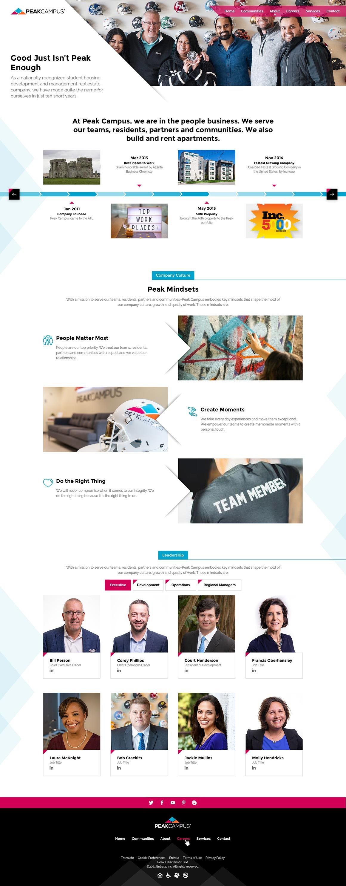
About Us Page
Designing the About Us page was all about blending storytelling with interactivity. The page invites investors to dive into the company’s journey, showcasing milestones through a vibrant, visually engaging timeline. The design keeps things on-brand—clean, modern, and fun—while ensuring functionality shines through.
Values and programs are presented with bold visuals and thoughtful layouts, offering quick insights without overwhelming the user. A tabbed employee list adds an interactive twist, allowing visitors to easily explore the leadership team and get to know the faces behind the brand. It’s a page that not only informs but also builds trust and connection, all while keeping the experience lively and engaging.
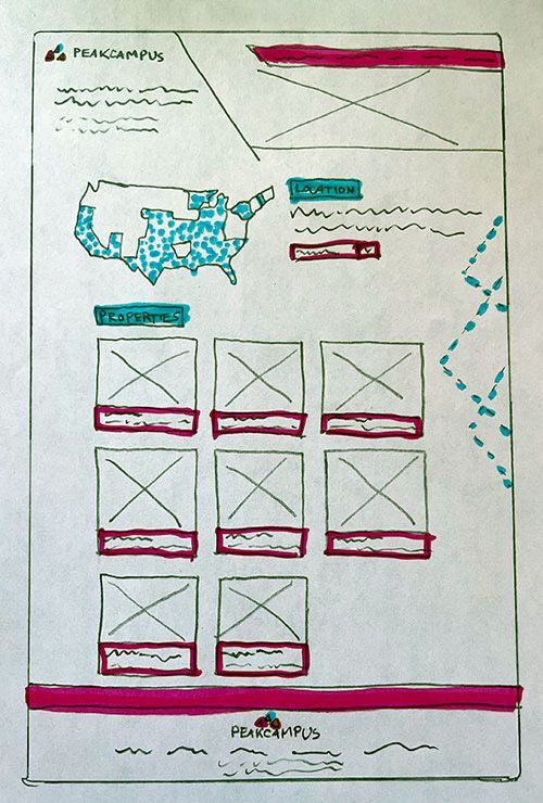
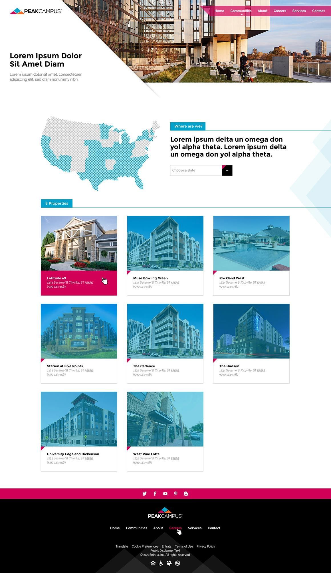
Properties Page
This page makes exploring the portfolio a breeze. Investors can get a big-picture view with a map showcasing the full scope of their properties. From there, handy filters let them sift through the list to find exactly what they need.
Clicking on a property opens up a treasure trove of details, including vibrant images, current availability, prime location info, and a full rundown of amenities. It’s all about keeping things clear, quick, and a little bit fun—making property management feel less like work and more like discovery!
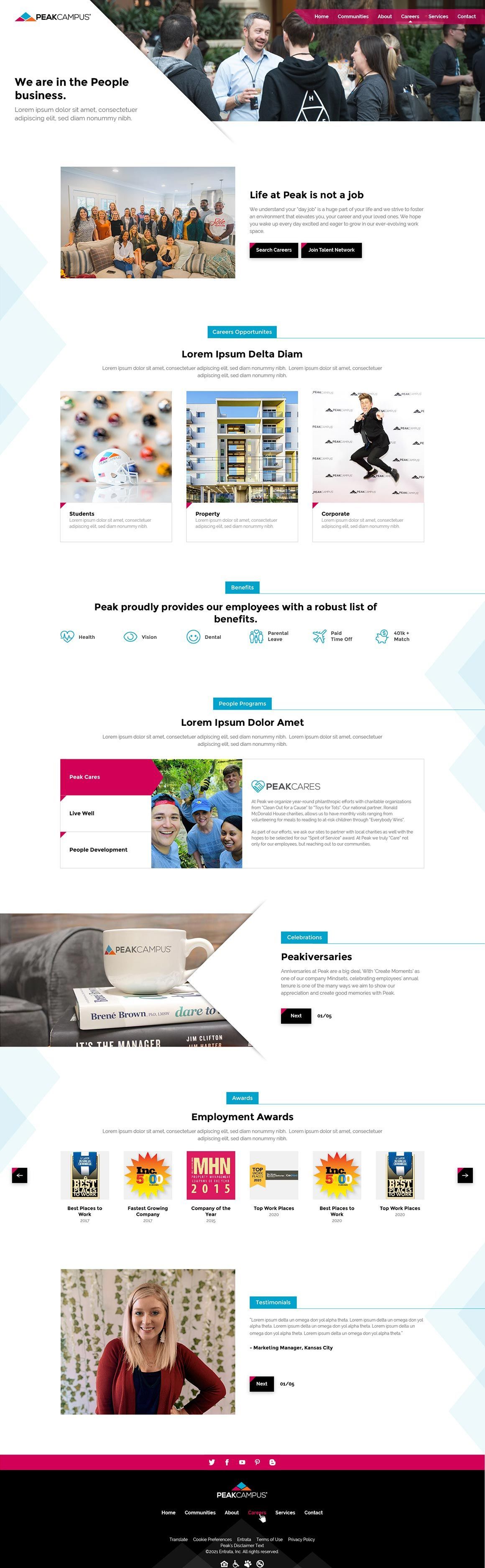
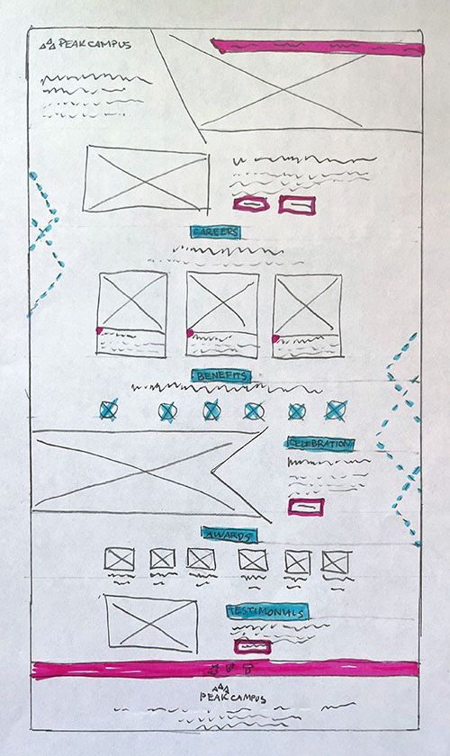
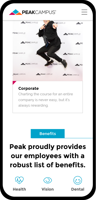
Careers Page
The careers page is all about showcasing the brand’s vibrant, youthful energy. Every element promotes Peak Campus as a fun, active place where young professionals can thrive—both at work and in life. Bold visuals and dynamic layouts highlight job opportunities, networking possibilities, and growth paths.
The design strikes a balance between professionalism and playfulness, with vibrant colors and engaging graphics that reinforce the brand's identity. Employee programs, benefits, and awards are displayed with a fresh, modern touch, while testimonials bring authentic voices to the forefront. It’s not just a careers page—it’s an invitation to be part of something lively and impactful!